September 27, 2025
The digital world is increasingly home to essential spaces for marginalized communities to nurture relationships with each other and strengthen cross-cultural solidarity. To ensure Asian-Indigenous Relations is a space that promotes community building and the decentralization of knowledge, we wanted to design something that allows us “to talk with people we don’t understand, instead of about them [emphasis added our own]” . Because design can be leveraged as a tool to visualize and expose structures of power , AIR's brand identity spotlights Asian-Indigenous relationalities, offers counter-narratives regarding the importance of these braided histories, and uplifts marginalized voices that the settler-colonial state of Canada has historically invisibilized . A large component of crafting the digital world of AIR is visual storytelling, the main topic of this article.
This article discusses the process of developing AIR’s visual identity and how we leverage color and symbols to reflect the mission and values of AIR, creating a platform which allows marginalized voices to take up space in a vast digital world. A strong brand identity represents more than just a product or service; it can be used to establish AIR’s mission in empowering Asian-Indigenous voices that have been hidden or ignored.
We begin with a chronological description of the designing process, reflecting on the nuances and impact of design as a tool within the decolonial movement. Design otherwise and disciplinary disobedience are the lenses through which the creation of AIR’s brand identity is explored in this paper. Design otherwise is the lens through which decoloniality crosses borders of thought to craft another space for producing knowledge that counters great modernist (read: Western) narratives . Building AIR’s brand within and against settler colonial Canada is an act of designing otherwise. The latter lens, disciplinary disobedience, counters the argument that borders separate us from them, a settler colonial ideology that persists within and beyond specialized design fields , making design a relational and geopolitical act . When creating the identity for AIR, we worked to integrate various non-design concepts, such as elements of reconciliation. It was important for us to align our design efforts with Indigenous sovereignty and nationhood because AIR’s mission is to continue fighting for the decolonization and restitution of the stolen lands our digital resource resides on.
Logo Development
In June, we began brainstorming ideas for the logo, which we wanted to symbolize the intertwined histories and futures of Asian and Indigenous communities. Our initial idea was to connect the letters “AIR” with a ribbon, but soon realized doing so felt contradictory because the ribbon was tying the letters together in a way that felt constrictive, like boundaries that were closing in on, instead of connecting Asian and Indigenous communities together. Because “...design and its thinking is deeply complicit in many structural systems of oppression, serving to concretize, perpetuate, and disseminate power and privilege,” we did not want AIR’s brand identity to play a part in perpetuating the settler colonial powers that continue to affect these communities. We ultimately decided to move forward with brainstorming other ideas.
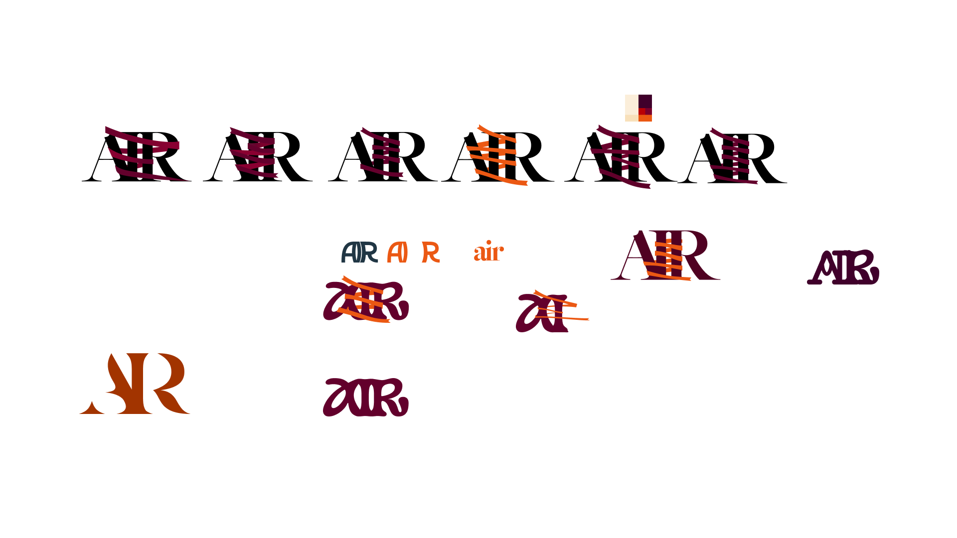
After the first iteration, we both agreed that the logo should represent the semantic nature of Asian-Indigenous relations. We particularly wanted the logo to reflect how braided relationalities, media, events, and organizing efforts from the past continue to influence today’s Asian and Indigenous decolonial and solidarity movements. We explored different ideas of badges and emblems, such as the logo seen in Figure 2. We designed several types of emblems with the motivation to represent braided histories (see Figure 3). Our first attempt at this was to have two circles connected by a ribbon as a way to visually represent Asian and Indigenous communities that have been tied together throughout history. However, we ran into a similar problem that we experienced with the letter logo: because the circles were designed where one circle was inside the other (see Figure 2), the logo was giving the impression that one community lives within the other, a misunderstanding that we did not want perpetuated through AIR’s visual identity. The ribbon motif in both Figure 1 and 2 failed to properly communicate our intended messaging because of the constricting nature of the first two iterations. They also felt too complicated, and the aesthetics were more important than the message in our first two iterations.
While these concepts might have been visually successful, it was hard to portray the exact messaging and tone we wanted, especially taking into account our goal of makingAIR an accessible educational resource. Our design processes must allow and help make space for any individual to explore the histories and futures of Asian-Indigenous relationalities.
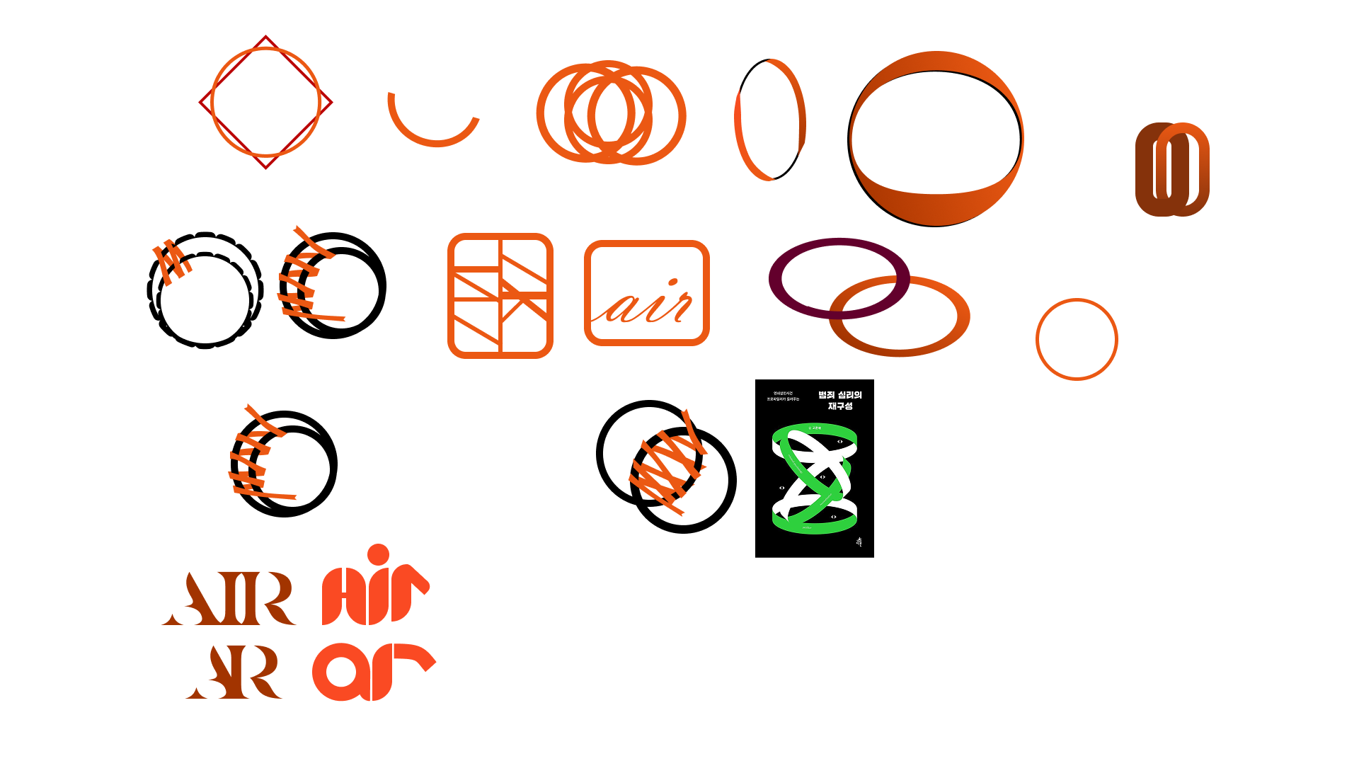
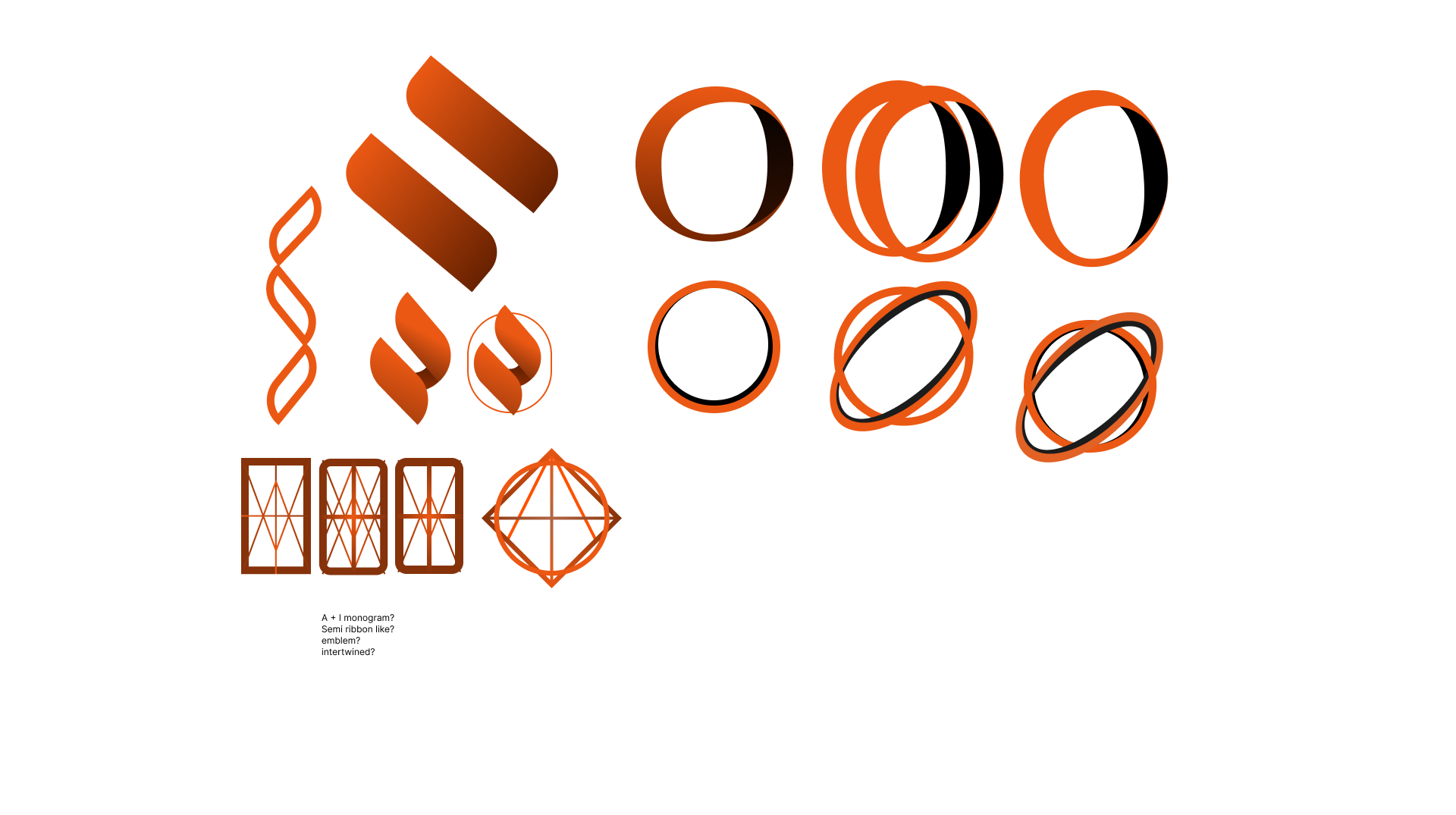
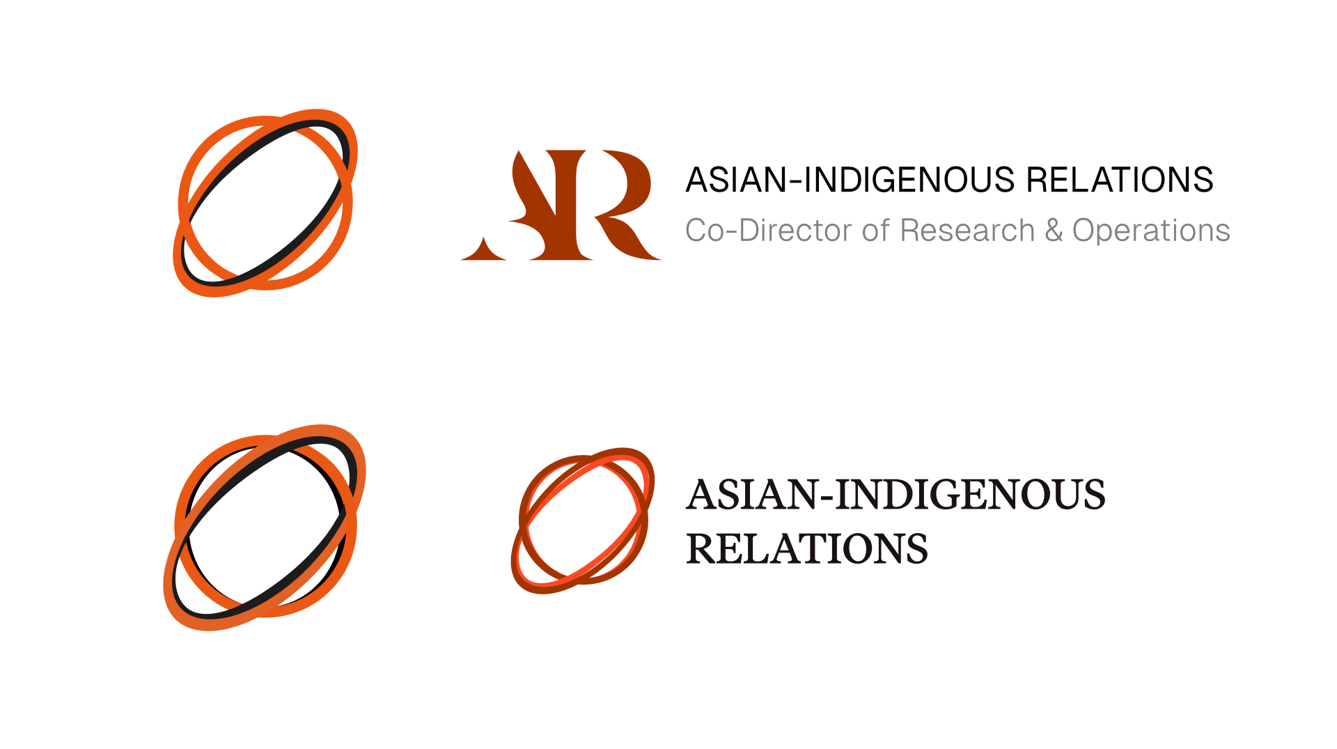
And so, we iterated for a third time (and it was a charm!). The logo we eventually landed on were two interconnected circles. We realised that simplicity would be the best course of action for the logo, and it allowed us to communicate the main aspect of AIR: braided histories and futures. A well-constructed design can be leveraged as a communication tool to expose structures of power , so we wanted to ensure that our logo is able to complement a powerful brand identity that is used to bring to light Asian-Indigenous marginalized voices and relationalities that have traditionally been silenced or ignored entirely by settler-colonial Canada.
Colour Palette Development
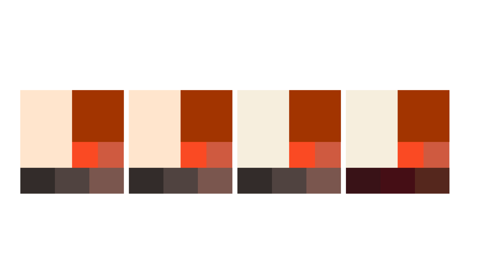
An aspect of design otherwise that is reflected in the process of creating AIR’s colour palette is the idea that “the creation and occupation of space by design cannot but be ideological and known in relation to other places, hence knowing where you are designing, or are going to design, is always geopolitical” . Located in Vancouver, we wanted to incorporate the colour orange which has defined ongoing Indigenous-led reconciliation movements, such as Orange Shirt Day (OSD). As an initiative to increase awareness about intergenerational trauma experienced by individuals, families, and communities due to the more than 130 residential schools that operated in Canada. OSD acts as a way to witness and honour the healing journey of Survivors and their families. OSD remains especially important within the socio-political landscape of so-called Vancouver and British Columbia , so we decided to incorporate orange into the final version of the brand colours, as seen in Figure 5.
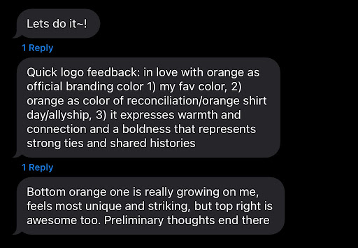
To get to the final version (figure 6), of course, was no easy feat. One of our goals for the brand identity of AIR is to communicate to all digital resource visitors that “you’re free to explore, and are welcome to stay and learn”. Traditional education resources tend to end-up feeling corporatized, due to executive decisions about the design system. Colour can be leveraged to further communicate messages, and as fellow co-founder Ty expressed via text to Cynthia (see figure 5), we wanted to express the warmth and boldness that is representative of creating and maintaining strong ties. This feedback pushed us to choose a warm orange hue as our primary logo colour as well as a combination of warm orange and brown tones for our overall visuals.
Conclusion
The creation of AIR’s brand identity was not just a simple design exercise but a deliberate and conscious act of resistance against the Design field as digital infrastructure continues to flourish, especially in allowing marginalized peoples to continue to take up ample space on our own terms. As the digital world continues to expand as a force of globalization, Design has remained implicated in white supremacy and settler colonialism dominant, failing to mirror the diverse ethnic makeup, and/or decolonial struggle that encompass Canada and the United States of America (the main nation-states in which AIR operates within and challenges). Despite a continued fight for and discussion of inclusion in design, aesthetic parameters themselves often lack inclusivity, failing to consider how design, as it exists, utilised and taught today, represents and serves communities of colour and Indigeneity .
As a product of Western cultural development, Design is implicit in furthering the neocolonial movement by perpetuating universal and neutral qualities, isolating itself from the social context that it resides in and the necessary socio-political roles that art and culture play . Historically, this has occurred when teaching design movements and creators, isolating them from the contexts within which they were born . To be able to engage with Design in such a way is a privilege of whiteness: for example, the stereotypical “chop suey” typeface found on American Chinese takeout menus and boxes represents visual Orientalism, a concept born out of the ideas of Edward Said, who argues the West is the active actor, judge, and jury on the behaviour of the Orient, which embodies a passive subjectivity. Taken together, “chop suey” typeface and Said exemplify the relationship between the ways design and typography (through the lens of whiteness) inaccurately represent non-white cultures and peoples . AIR’s design identity counters the settler colonial status quo by bringing to the forefront issues that Indigenous peoples experience within the settler-colonial state while also spotlighting long lasting connections with Asian diasporas (and their marginalization) that have formed out of resistances to the West .
AIR’s approach to visual storytelling and our design processes, emphasize Asian-Indigenous relationalities and the decolonial movement, and actively challenges the status quo of Design by crafting a brand identity that is reflective of inclusivity, exemplified by braided histories, and attuned to the socio-political landscape in the regions we operate in. Carving out and designing a space in today's digital landscape requires AIR to amplify marginalized voices and continue to foster a non-hierarchical collaborative space where cross-cultural solidarity can thrive.. AIR is a testament to the transformative power of conscious design when it is used to uplift and empower Asian and Indigenous communities who have been historically silenced and invisibilized, both together and separate.
AIR’s core mission is to fight for the decolonization and restitution of online and offline colonial spaces. By embracing a design process that is reflective of socio-political contexts and relations that we as a collective are reckoning with, we continue to challenge the status quo of Design, providing a brand and platform that actively welcomes members and communities of colour to be seen and heard in the digital world. After reading this, we hope that other brand designers and scholars start to see the importance of how conscious design can be used to uplift and assert marginalized communities both online and offline.. AIR continues to illuminate a path towards an equitable and critical design landscape, while documenting and advocating for braided Asian-Indigenous struggles, histories, and futures.